Planning on opening their first new shop in the UK, Pinkberry London approached us for the design.
Our proposal tries to address the audience of East London, an area where trends are being tested by very design-aware people, while keeping a clear representation of the Pinkberry philosophy. The vision was to reinvent the Pinkberry design, and provide a bespoke new look and identity for the London location.
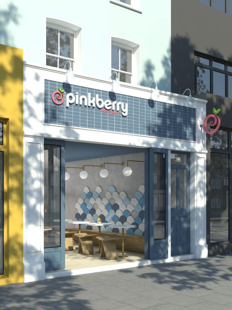
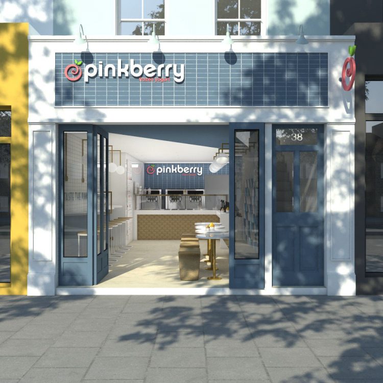
We envisaged a fresh looking facade, with white tiles and blue door frames, trying to differentiate the shop front visually from its next door businesses. Our goal was to make it look sharp and clean, creating a strong association with frozen yogurt. The folding doors can be opened during the summer months to reveal the shop interior and be more inviting to passing customers.
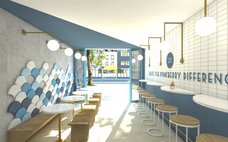
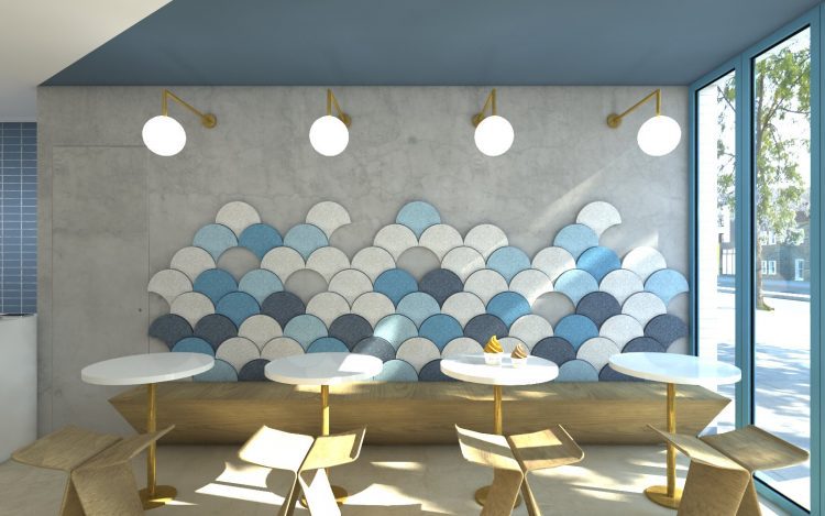
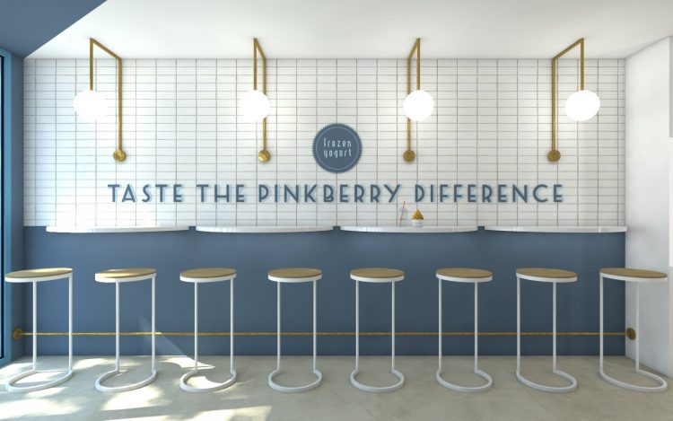
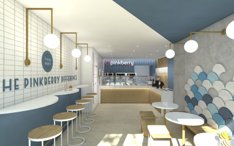
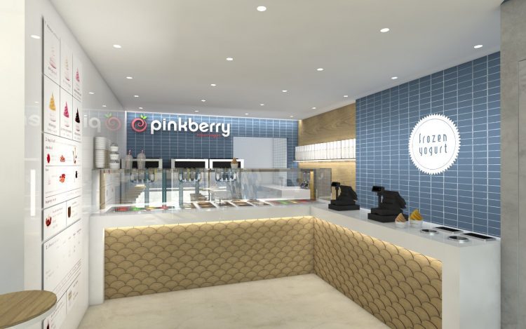
The interior of the shop posed a challenge, being quite narrow and long. Our design ideas to make the space feel larger was to use a very simple wooden bench with no backrest and have a vibrant pattern of felt acoustic panels to act as cushions, saving some precious space. The wooden element is being repeated in the stools opposite the bench, where again we chose items that are light and open, giving the space continuity and therefore making it feel larger.
Finally, the lighting is a strong feature of the shop, with brass fixture spheres coming out of both walls. Having a limited height and width, we had to use small diameter lights so that the space doesn’t feel disproportional and dominated by them.
